Pattern design
2025
PM and developers
End-to-end design (discovery → delivery)
PMs, developers
January 2026
Context
In WFM SaaS I worked on, users work with large sets of entities—people, schedules, requests, rules—and constantly associate, filter, and modify them through CRUD workflows.
Over time, this led to many different data views across the product: tables, lists, timelines, each built for a local need.
While each view worked in isolation, the overall experience didn’t scale well. From a design system perspective, we were missing a shared DataView pattern that designers and engineers could reuse consistently—both visually and in code.
Problems
After surveying existing usages, several inconsistencies emerged:
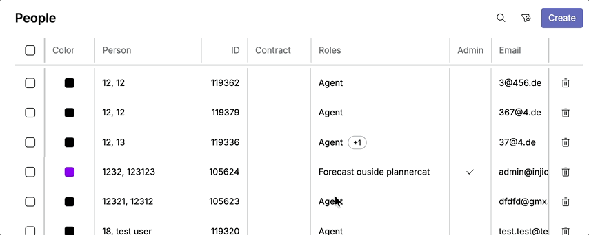
image placeholder: survey
Structural fragmentation
- Some data views had page titles, others didn’t
- Bulk action bars appeared in different positions—or not at all
- Actions (search, filters, create, overflow) varied in placement and behavior
Filtering inconsistencies
- Some views required a filter to show meaningful data
- Others could safely display all data with pagination for performance
- Default filters behaved differently across pages
UX cost
- Users had to relearn filtering patterns on each page
- Designers debated “special cases” repeatedly
- Engineers implemented similar views with slightly different APIs
The underlying issue wasn’t visual polish—it was the absence of a shared mental model for what a DataView is and how it should behave.
1st Iteration
Based on the shared usage analysis, I introduced an initial DataView pattern in the design system.
Core idea
The DataView standardizes views that organize and display collections of data efficiently, while allowing controlled customization for searching, filtering, and actions.
It was intended to support:
- CRUD and association patterns
- Table- and list-based collections
- Selection-driven workflows
Anatomy

The pattern was structured into three sections:
- Header
- Data
- Footer
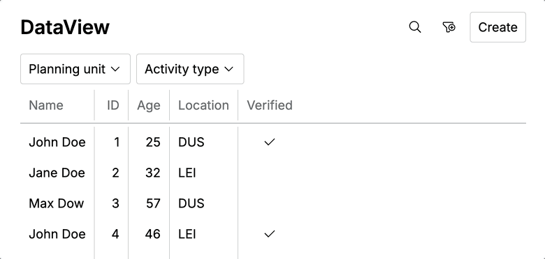
Header

- Page title (optional)
- Search
- Filter trigger
- Primary action (e.g. create, download)
- Overflow actions
Two variants existed:
- A default header
- A variant with a primary slot for required interactions before data could be shown
Data

- Rendered a collection component:
- Table (primary)
- List (secondary)
- Timeline (in rare cases)
- Rows or items linked to detail views and CRUD actions
Footer

- Pagination
- Total item count
The goal was consistency without over-constraining product teams.
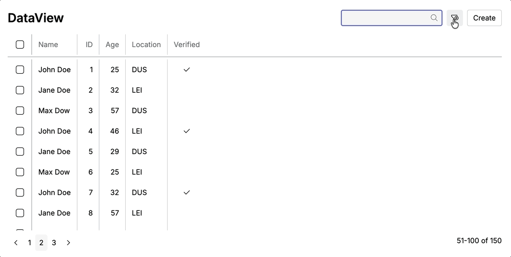
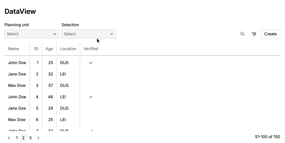
Demo
Without primary slot
With primary slot
Lessons from 1st Iteration
Once the pattern was used in real products, its weaknesses surfaced quickly.
Technical friction exposed UX gaps
| Area | Issue |
|---|---|
| Default filters | - Default filters could not be active without showing a filter pill -This forced technical transparency into the UI, even when it harmed clarity |
| Primary slot filters | - Not part of the filter schema - No standard API |
| DataView flexibility | - No date-range filter type - No support for summary or footer data |
“primary-slot” problem
- There were no clear rules for what it could contain
- It wasn’t visually or behaviorally connected to filtering
- It wasn’t opinionated enough:
- Should it always be visible?
- Can it be prefilled?
- How does it differ from optional filters?
Mental model mismatch
We used form components for primary filters, but this felt wrong:
- Form fields imply data entry and validation
- Primary filters express context and scope, not form submission
- Preselected values were confusing without labels or explanation
Confusing boolean filters
Show opposite value via checkbox, it is not boolean logic:
Responsive layout issues
- On smaller screens, search and filters wrapped to a new line
2nd Iteration
The second iteration focused less on UI tweaks and more on clarifying intent.
| Area | Change | Result |
|---|---|---|
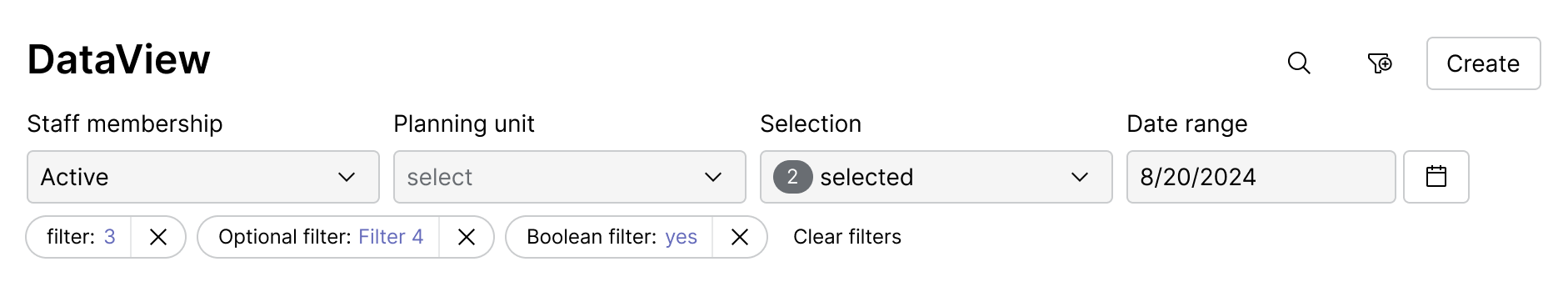
| Primary filters as new category | Redesign primary filter to be a distinct category with clear rules and behavior | Removed ambiguity and aligned filtering with real user intent |
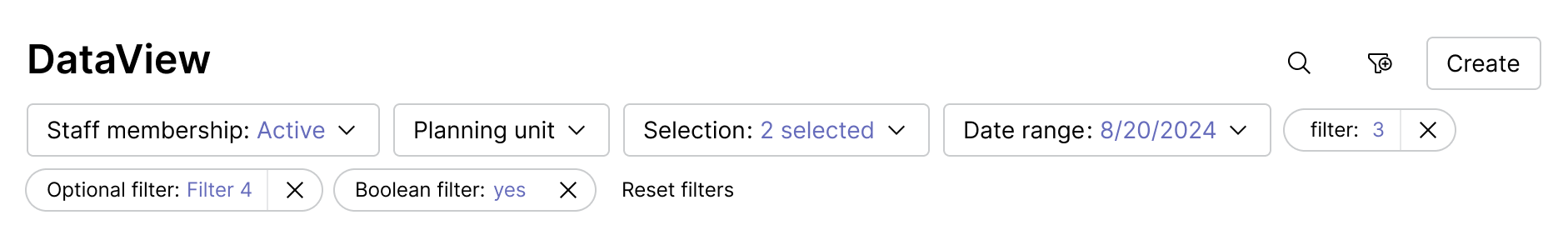
| Boolean logic | Standardized boolean filters as tri-state (All / true / false); Defaults shown in permanent slot | Removed ambiguity and aligned filtering with real user intent |
| Action labels | Renamed “Clear filters” to “Reset filters” to restore all defaults | Clarified scope and matched user expectations |
| Responsive layout | Aligned permanent and optional filters in a single row | Saved vertical space and improved cross-device clarity |
| API alignment | Passed full server responses; standardized date, time, and duration filters | Enabled summaries, richer footers, and scalable DataViews |
Key changes in header

UI improvements
1st iteration →
1st iteration →
Outcome
The refined DataView pattern resulted in:
- A clearer, more consistent interaction model across data views
- Less UI noise and better use of space, especially on smaller screens
- Fewer design debates about “special cases”
- Faster implementation of new views with predictable behavior
- A shared vocabulary between design and engineering
Even without hard metrics yet, the qualitative impact was obvious in day-to-day work.
Key Learnings
-
Consistency does not mean sameness
Predictable variation is more valuable than rigid uniformity. -
Primary filters are not UI details
They are system-level decisions that define context. They are not “more important filters”—they define what data exists in the view. -
Form components carry mental models
When the model doesn’t match the intent, the UI will always feel wrong. -
Boolean filters are rarely binary
Designing them as tri-state from the start avoids hidden complexity.