Context
Personal portfolio website
-
2025
My role
- Stakeholder executes design, develop and maintain
Result
- Scalable and maintainable website that effectively communicates my design experience and thinking
- A area to share insights and reflections on design work
Reusable knowledge
- Resueable components and a clear content structure are key to maintaining a portfolio over time
Motivation
For a long time, I struggled with how to present my work. Screenshots alone felt insufficient. What mattered more was understanding:
- how decisions were made
- how constraints shaped outcomes
- what lessons were learned
A Portfolio is a product, I treated this website the same way I treat any digital product:
- it has users (hiring managers, design leads, designers)
- it has goals (clarity, trust, memorability)
- it has constraints (time, attention, cognitive load)
This mindset changed everything. Instead of asking “How do I make this impressive?”, I asked:
What should this product communicate to its audience?”Design principles
With over 10 years in B2B SaaS and a formal design background, I wanted this site to feel confident and calm — not loud or trend-driven. Beyond product work, I’m drawn to spatial thinking, motion, and screenless interactions. Elements of space, structure, and movement are intentionally infused into the visual design and animation.
Polished UI alone isn’t enough — what matters is how decisions are made and reflection. Each case study highlights:
- decisions
- constraints
- trade-offs
- key lessons.
This portfolio isn’t a chronological archive. It’s a synthesis of experience — patterns I’ve seen repeatedly in complex B2B products, design systems, and real-world constraints. The goal is not completeness, but signal.
Tone and voice
I intentionally designed the content for skimming:
- short sections
- clear headings
- visual rhythm
- breathing space
Text is concise and paired with images, diagrams, or code — using visuals instead of long paragraphs wherever possible. The experience is meant to feel thoughtful, playful, and calm — without becoming academic, casual, or empty.
Visual system
The visual system balances two influences: my professional experience in highly rational, structured B2B environments, and a more abstract, experimental personal design aesthetic. It is intentionally:
- abstracted — reduce visual noise and emphasize structure
- rational — clarity and hierarchy over decoration
- playful — subtle isometric and geometric elements to create a sense of space and multiple perspectives
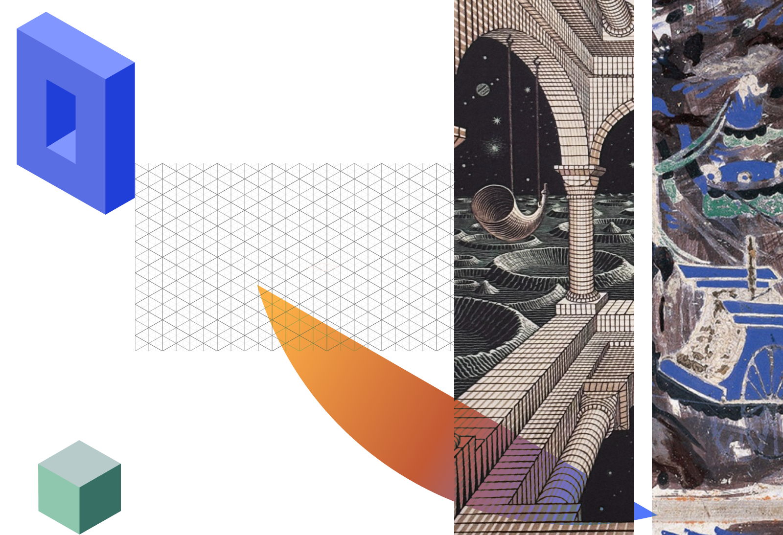
Exploring visual feeling by using mood board
Color and theme
I chose a high saturated blue palette, which can highlight the key information in a calm way.

Colors system
Base on the design principles, I created a set of UI components that are:
- minimal and functional
- consistent in spacing, typography, and color usage

UI Elements
Content structure
Projects are grouped into two content types, each serving a distinct purpose:
| Type | Content | Purpose |
|---|---|---|
| Case Studies (deep, end-to-end) | Research, trade-offs, delivery | Demonstrate how I design and ship products |
| Show cases (short, focused) | One idea, one learning, one takeaway | Share specific insights and design reasoning |
Development
The site is built with Astro, leveraging a React-based component model. This allows me to implement and iterate on the design directly in code.
Anti-Patterns
Some things I consciously didn’t do:
- ❌ Endless image galleries
- ❌ Buzzword-heavy introductions
- ❌ Over-styled UI components
- ❌ Animations without meaning
Each of these creates friction between the reader and the reasoning. I wanted the opposite: low effort, high signal.