Context
Area of work
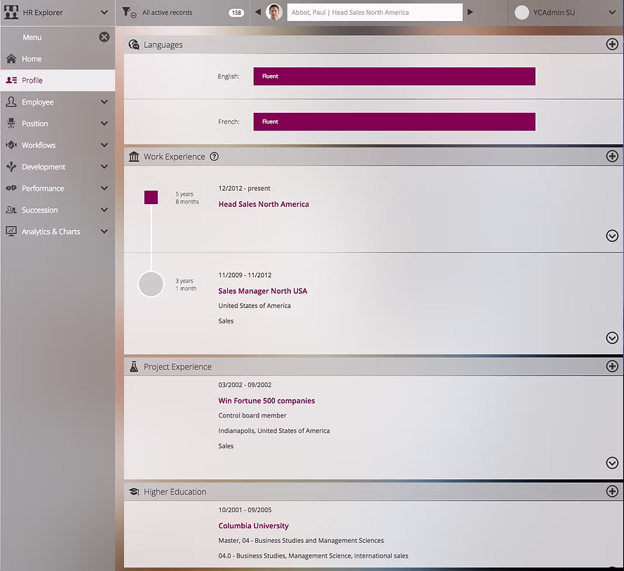
Navigation & dashboard on talent SaaS
Collaboration
PM and Developers
Time frame
2018
My role
- Led end-to-end UX/UI design
Result
- Improved cross-device usability (desktop + tablet)
- Strengthened visual consistency across tenants despite customization needs
- stablished a scalable dashboard framework for future feature growth
Reusable knowledge
- Dashboards should prioritize action, not information
- Navigation is not structure alone — it defines who owns the workspace and what matters in context.
Introduction
This project redefined the navigation and dashboard experience of a Talent Management SaaS platform. The goal was to create a clear workspace structure, reduce visual noise, and improve usability across desktop and tablet.
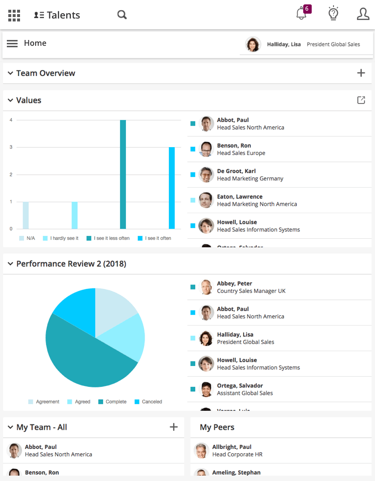
Before
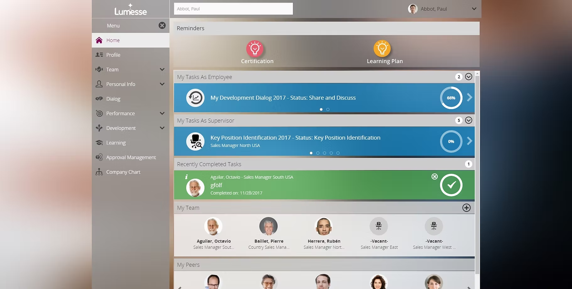
The previous interface suffered from structural and visual complexity:
- No clear workspace ownership — users lacked orientation.
- Fixed left navigation showed irrelevant functions.
- Heavy use of icons and colors without functional value.
- Over-customization (background, fonts, selection styles) created inconsistency.
- Homepage overloaded with notifications instead of actionable insights.
- Limited tablet usability.
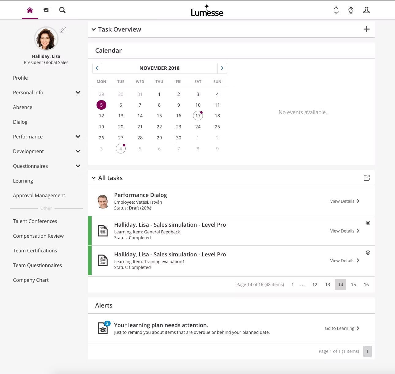
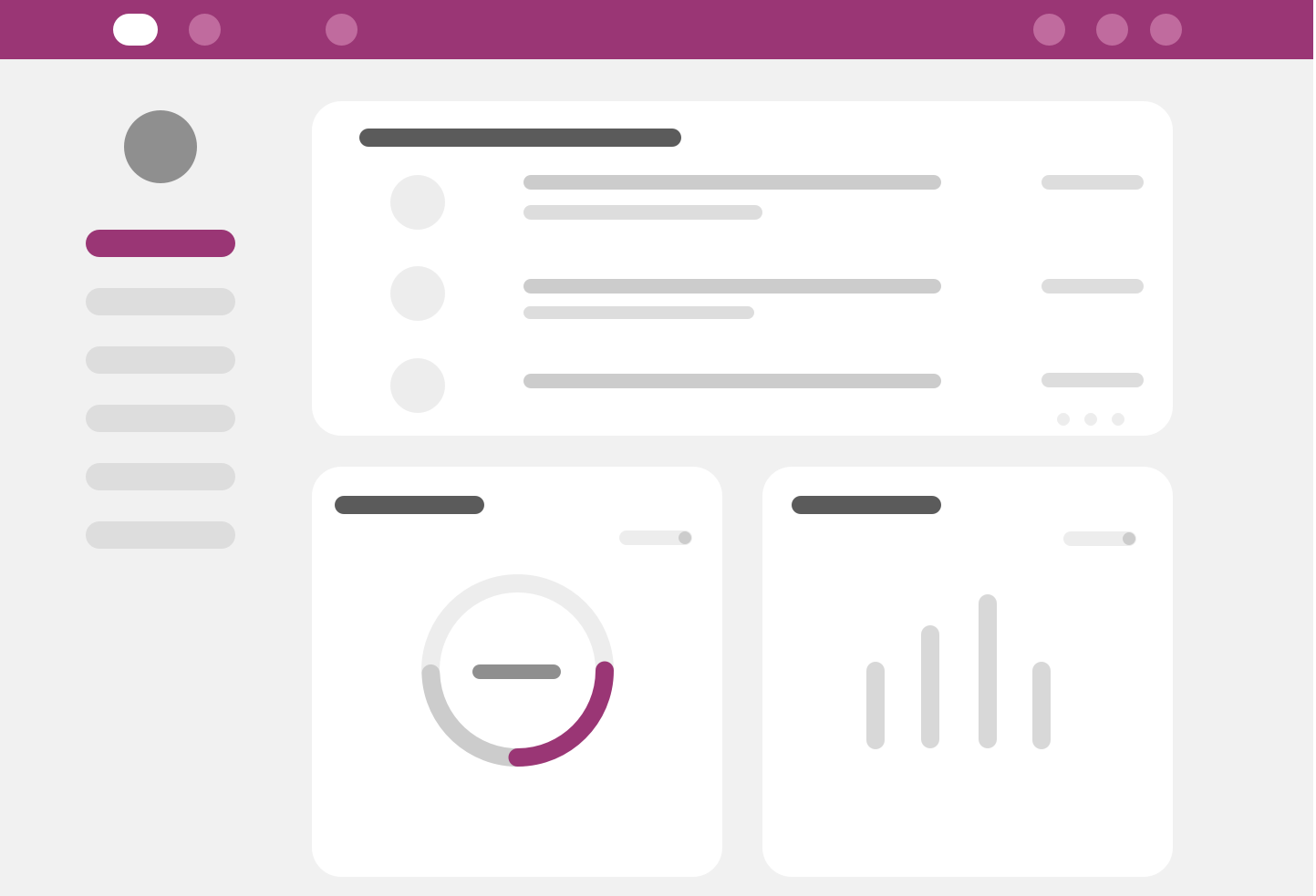
After
The 2018 Summer Release introduced a simplified and structured UX:
| Area | Key Improvements |
|---|---|
| Clear Navigation Logic | • Context-aware navigation • Focused workspace per role • Reduced visual noise with stronger hierarchy |
| Dashboard as a Control Center | • Modular widget system • Goal status visibility with critical highlights • Action-oriented summaries instead of notification clutter |
| Cross-Device Usability | • Optimized layouts for desktop and tablet • Improved spacing, readability, and interaction patterns |
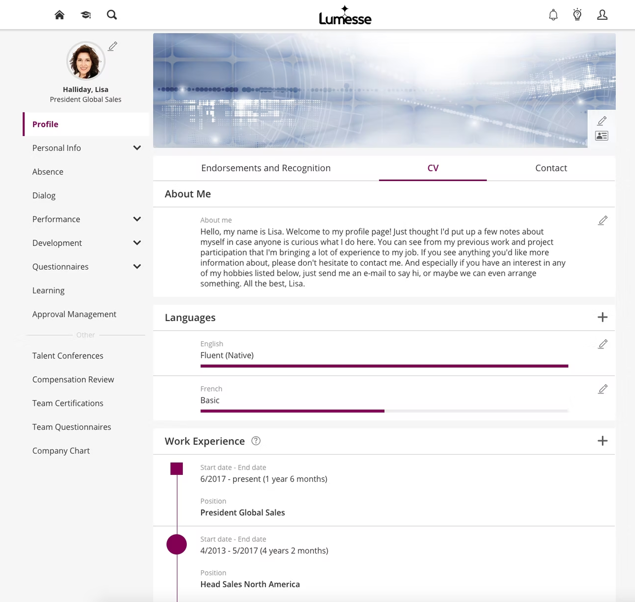
| Controlled Customization | • Flexible but guided personalization • Maintained visual consistency across tenants |
Outcome
- Clearer mental model of the system.
- Reduced cognitive load.
- Faster access to role-relevant actions.
- Improved tablet adoption.