Context
Area of work
Compensation Management (Talent SaaS)
Collaboration
PM and Developers
Time frame
2019
My role
- Led end-to-end UX/UI design
- Defined compensation information architecture and comparison logic
- Aligned data structure with product and engineering
Result
- Established a transparent and comparable compensation workspace
- Improved clarity of bonus and target evaluation
Reusable knowledge
- Comparison is the core user task in compensation workflows
- Clarity builds trust when financial data is involved
- Structured data relationships reduce cognitive load
Overview
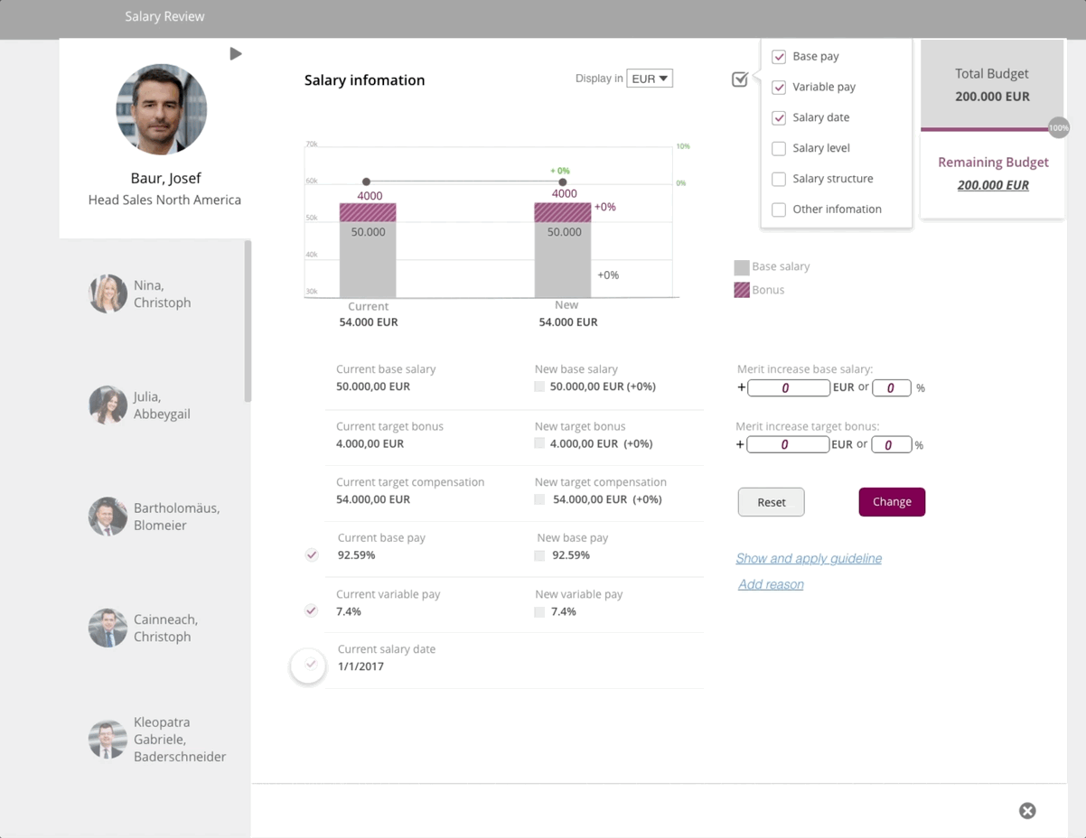
Compensation is one of the most sensitive and data-dense areas in Talent Management systems.
Users must evaluate base salary, bonuses, incentives, and benefits — often under time pressure and with high expectations of fairness.
The challenge:
Design a workspace that makes compensation outcomes understandable, comparable, and trustworthy.
Design principle: comparison first
Compensation decisions are rarely isolated, users constantly compare:
- Target vs. Actual
- Individual vs. Peer
- Remaining budget
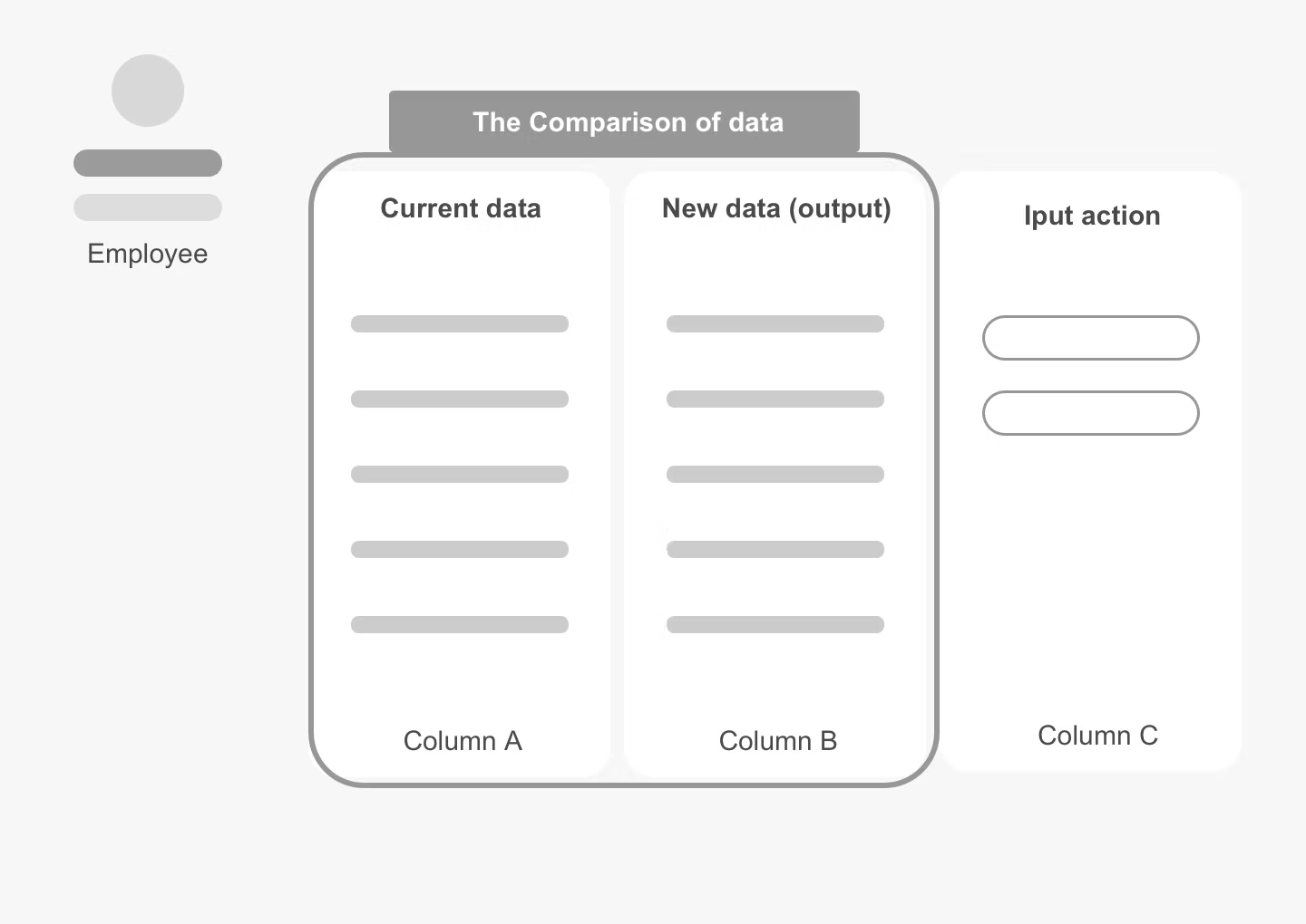
The interface was structured around a clear relational model:
Target → Actual → Difference
This visual logic allowed users to immediately see performance gaps and financial impact.
Information logic & visual strategy
- Reduced visual noise to highlight key financial signals
- Applied strong hierarchy for rapid scanning
- Balanced density with readability for desktop and tablet use
- Designed structured tables and summaries to support evaluation workflows
Outcome
The redesigned experience:
- Increased transparency across HR, managers, and employees
- Reduced ambiguity in bonus calculation and goal impact
- Built a scalable foundation for global compensation management